The Pearl
The Pearl
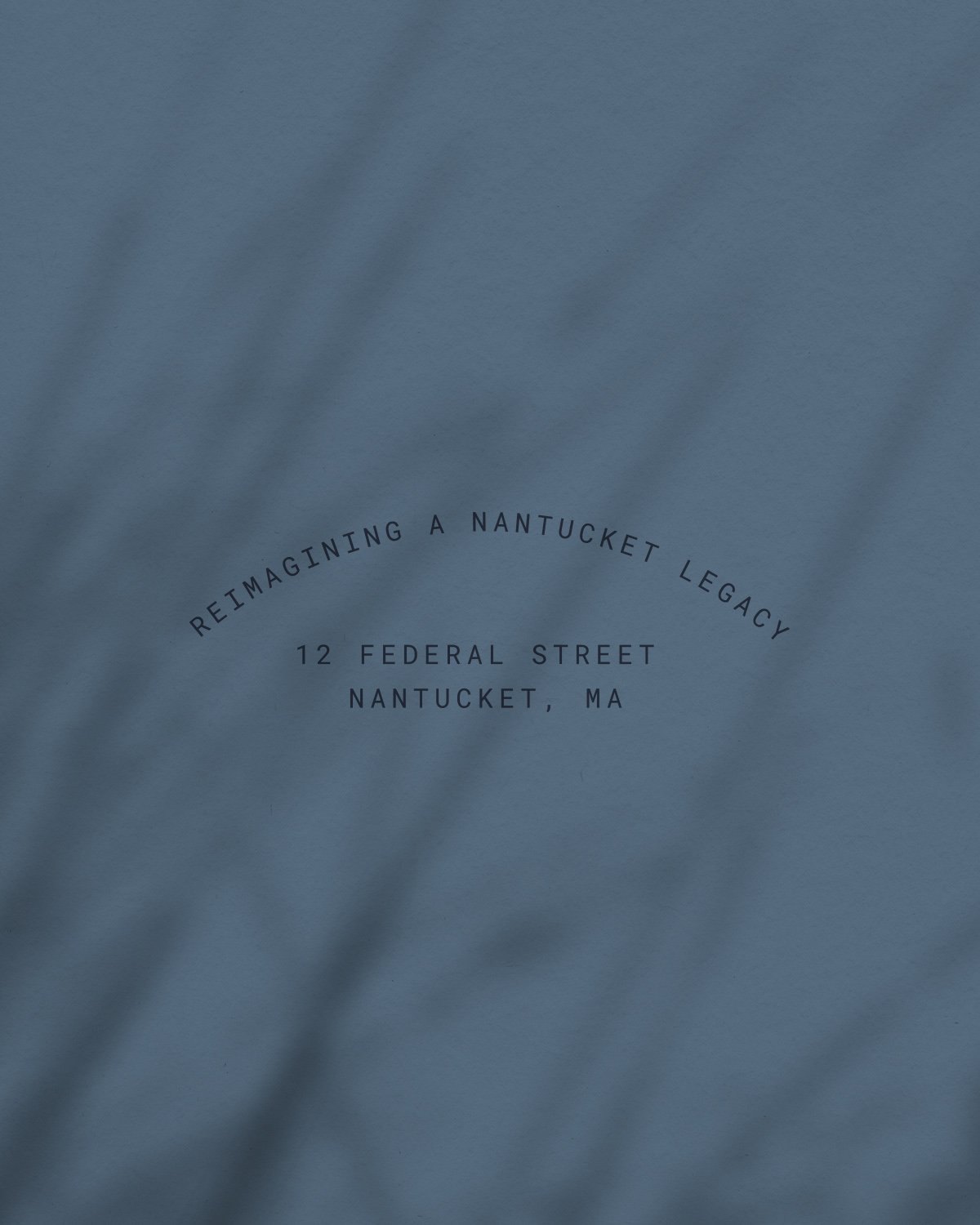
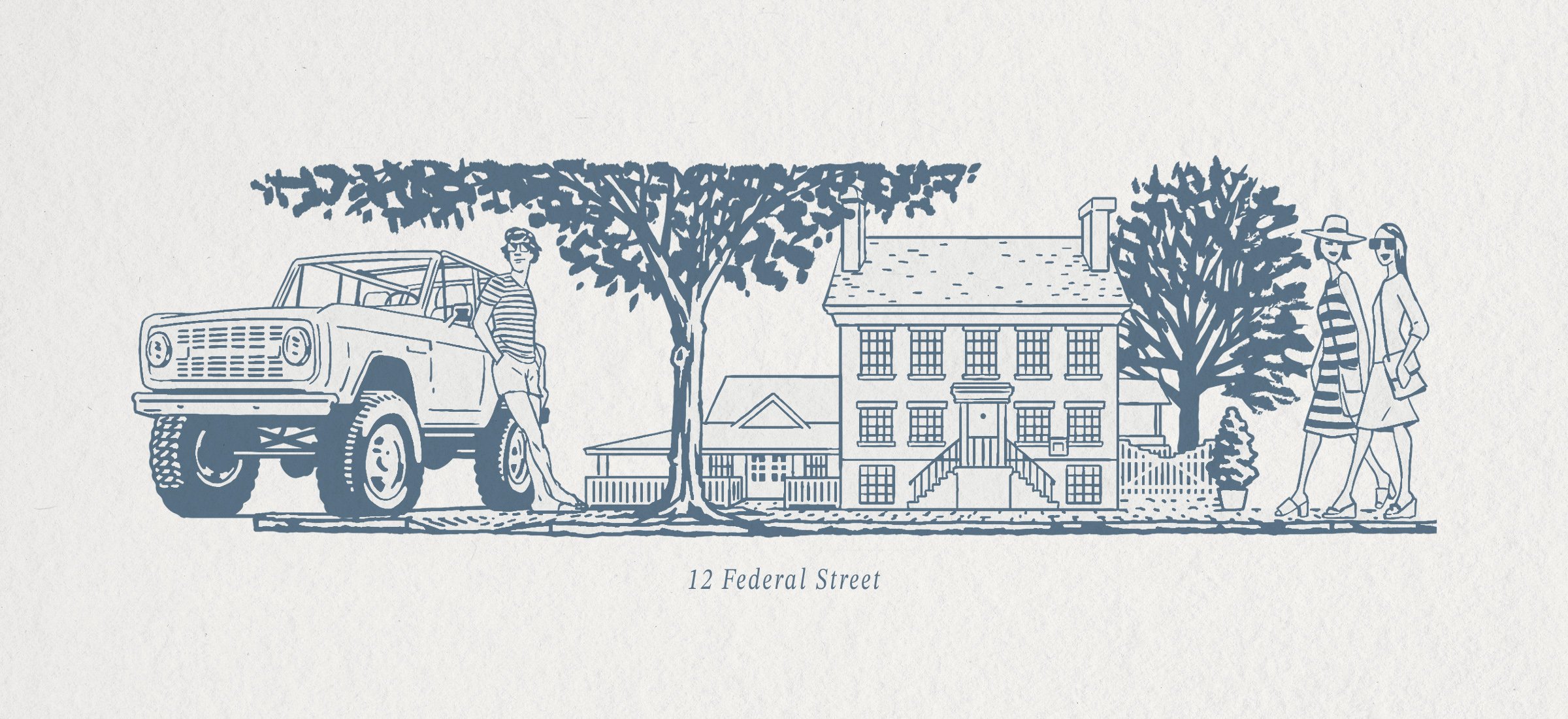
The Pearl has called the historic 1850s colonial-era boarding house at 12 Federal Street home for 30 years. The new branding, menu, and interiors write the next chapter while holding onto its rich legacy in the heart of Nantucket.
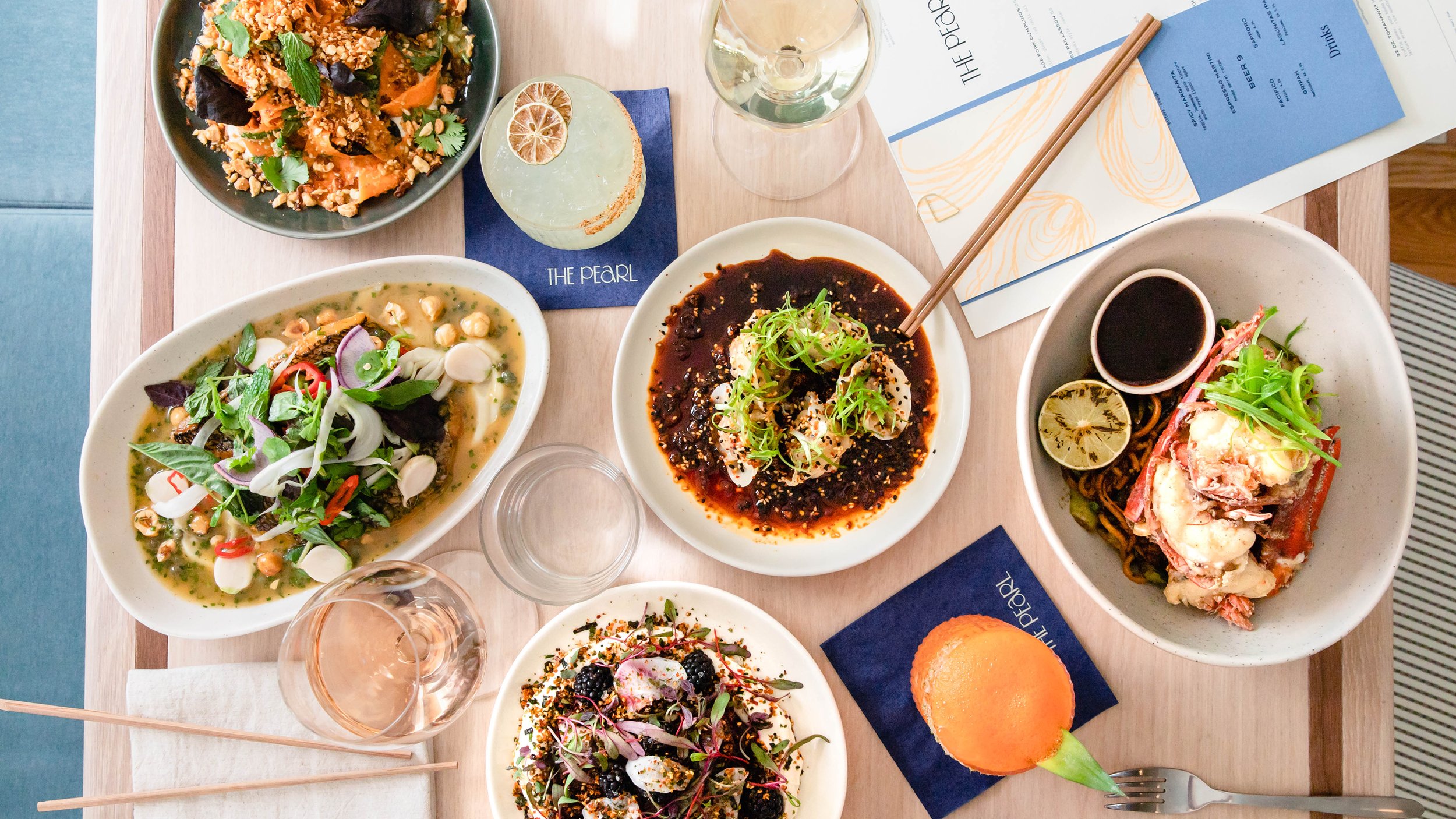
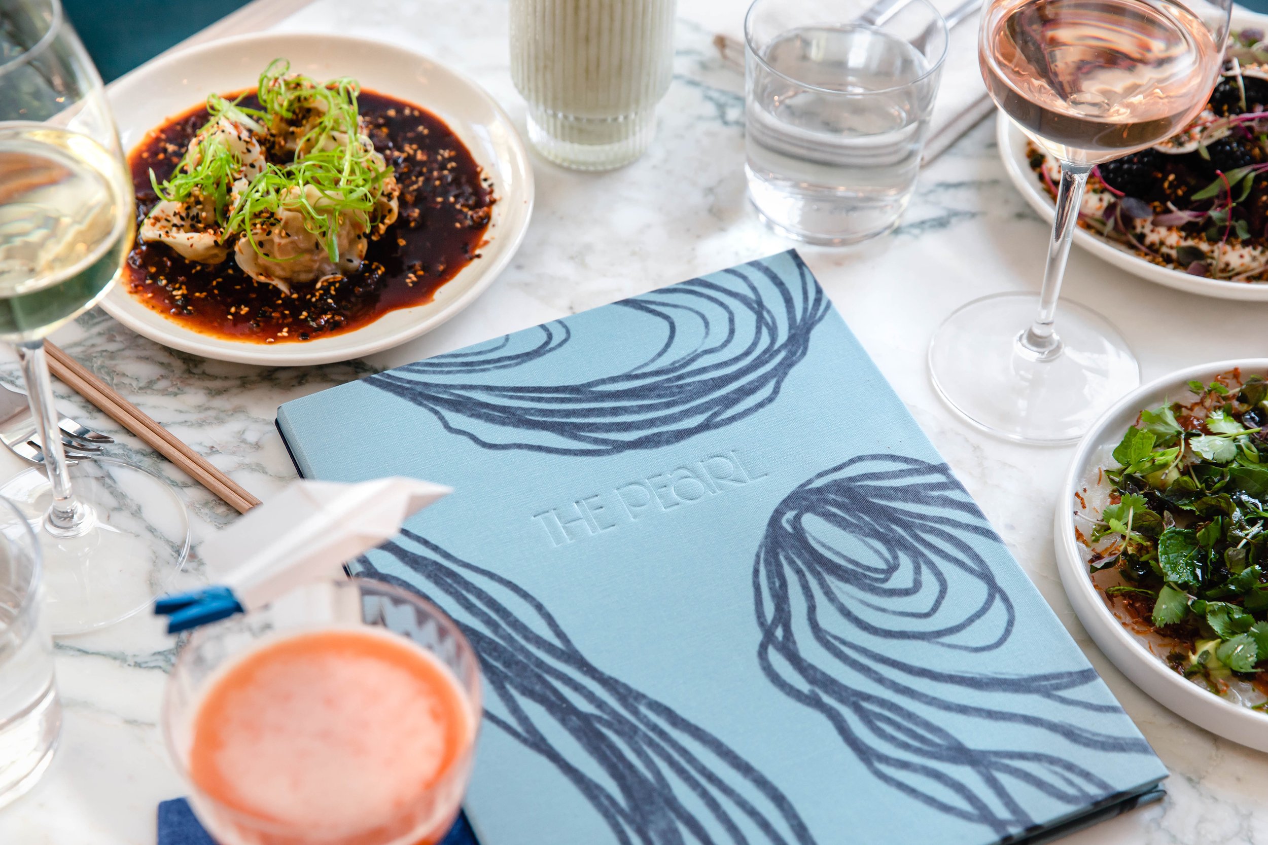
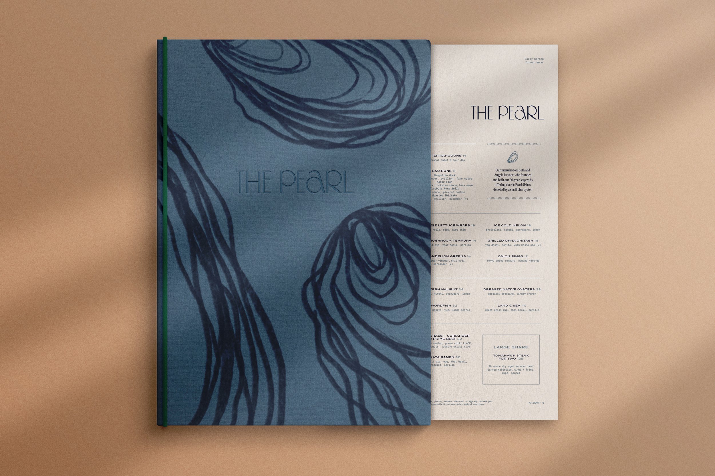
In partnership with Blue Flag Partners and Sonnyrose, we reimagined the visual identity of this treasured Nantucket institution, honoring its history while introducing a fresh, contemporary perspective.
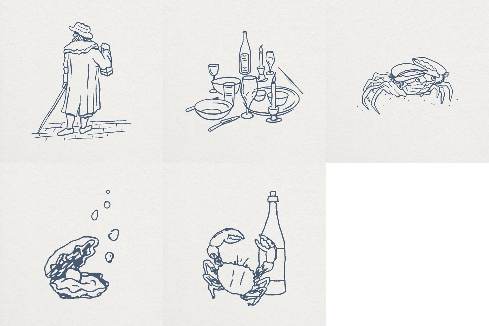
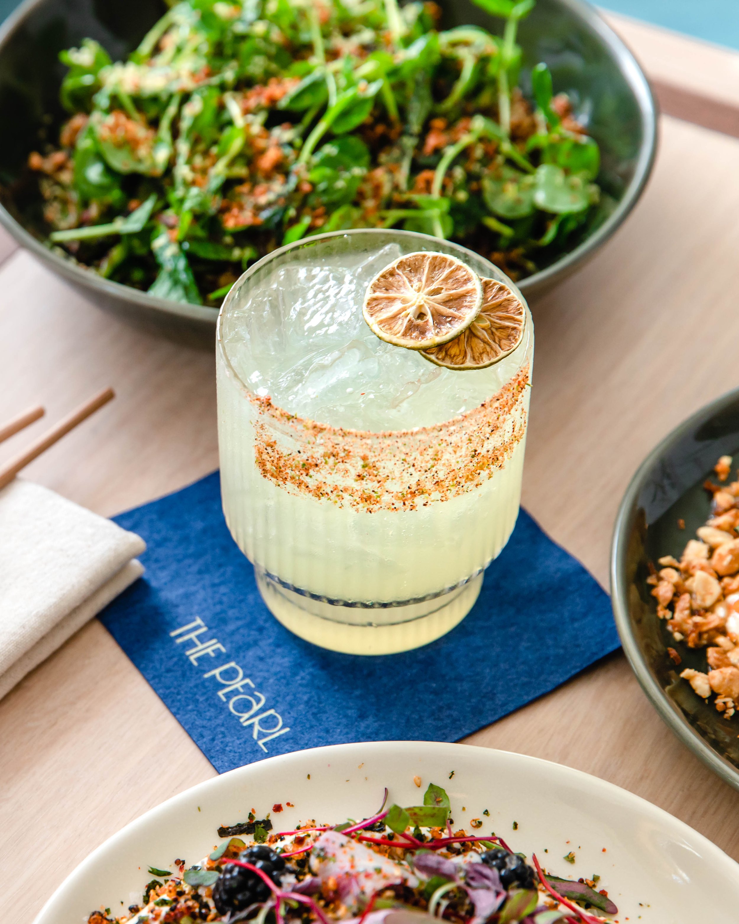
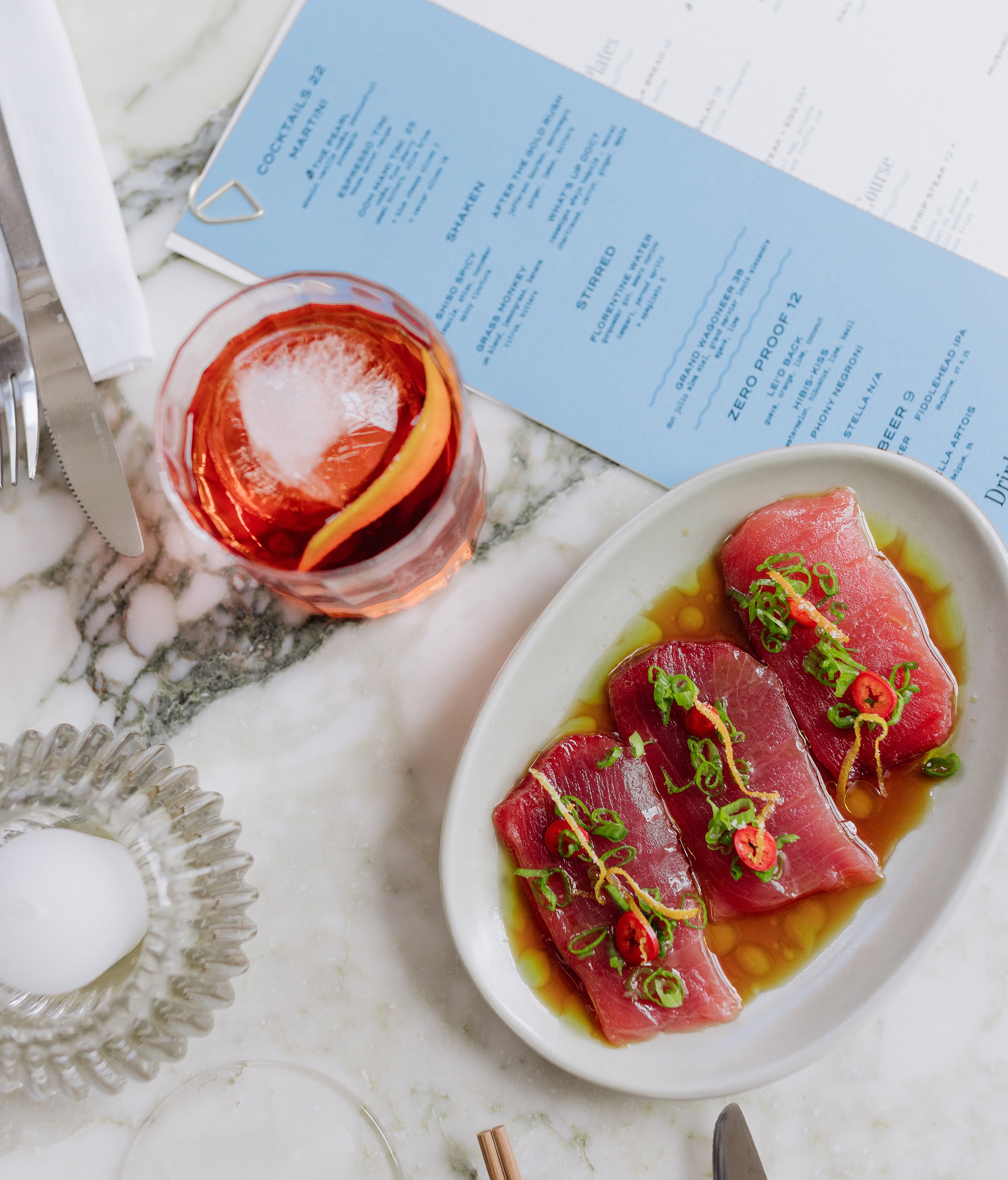
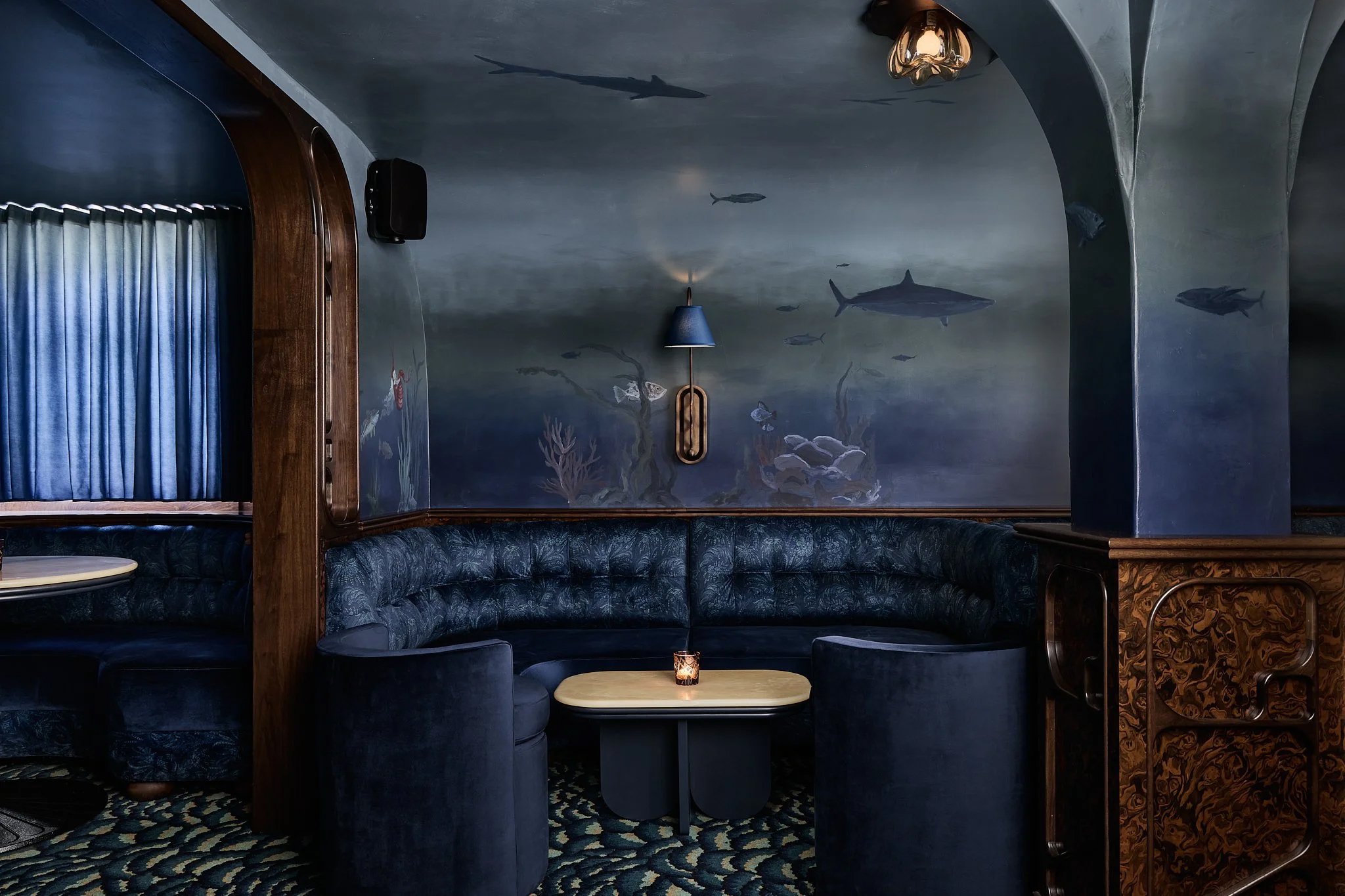
The bespoke wordmark draws its character from the form of a pearl. We also developed a suite of custom illustrations, patterns, and a color palette inspired by the historically approved colors of Nantucket homes. The result is a brand system that feels timeless, welcoming, and deeply rooted in New England's coastal heritage while complementing the warm, layered interiors designed by Home Studios.
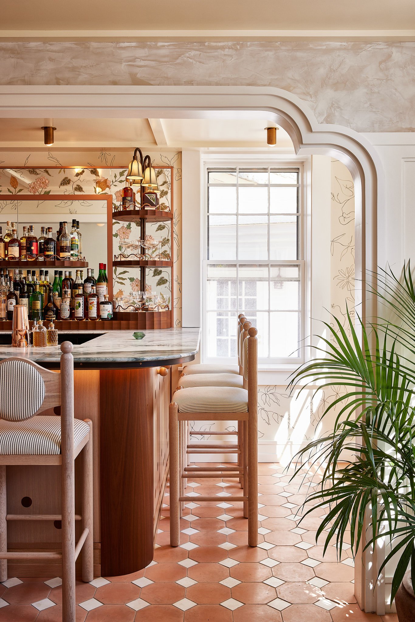
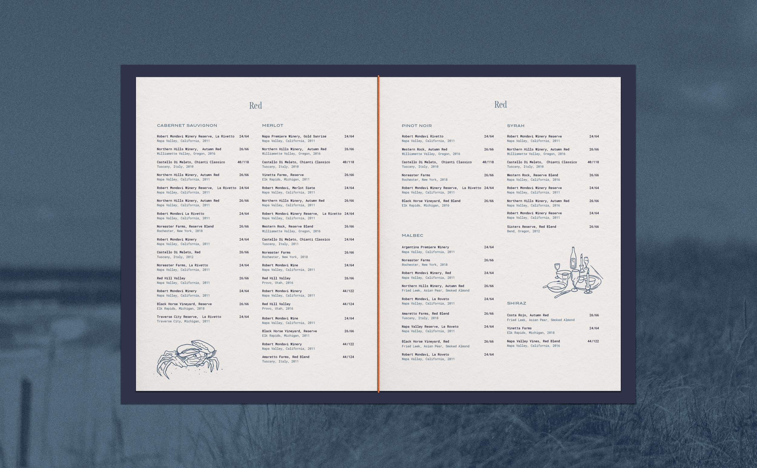
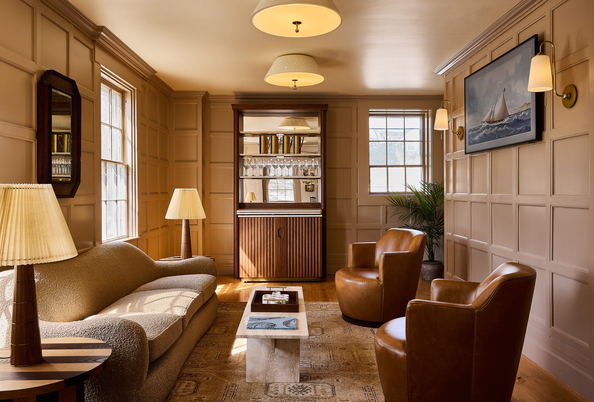

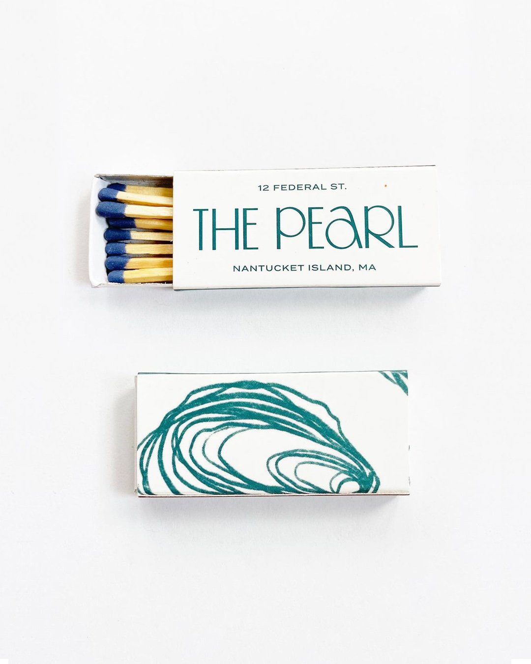
“Angela Raynor was famous for her hospitality, and we hope to continue that welcoming energy in a refreshed, elegant and fun environment. In some ways, it’s everything you remember about The Pearl, with just an updated look and feel.”
- Ricki Millington, Vice President, Experience + F&B
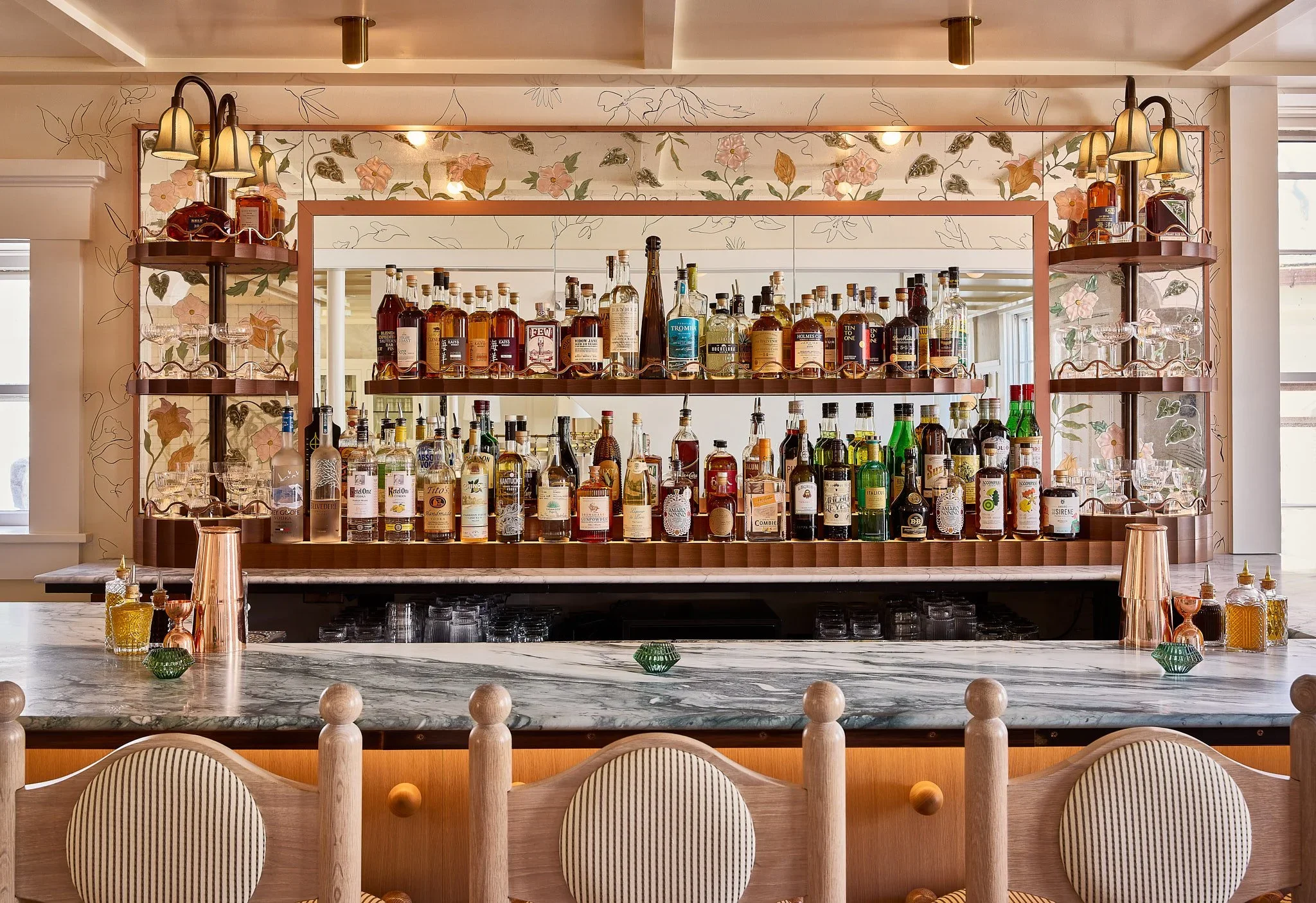
Below The Rose
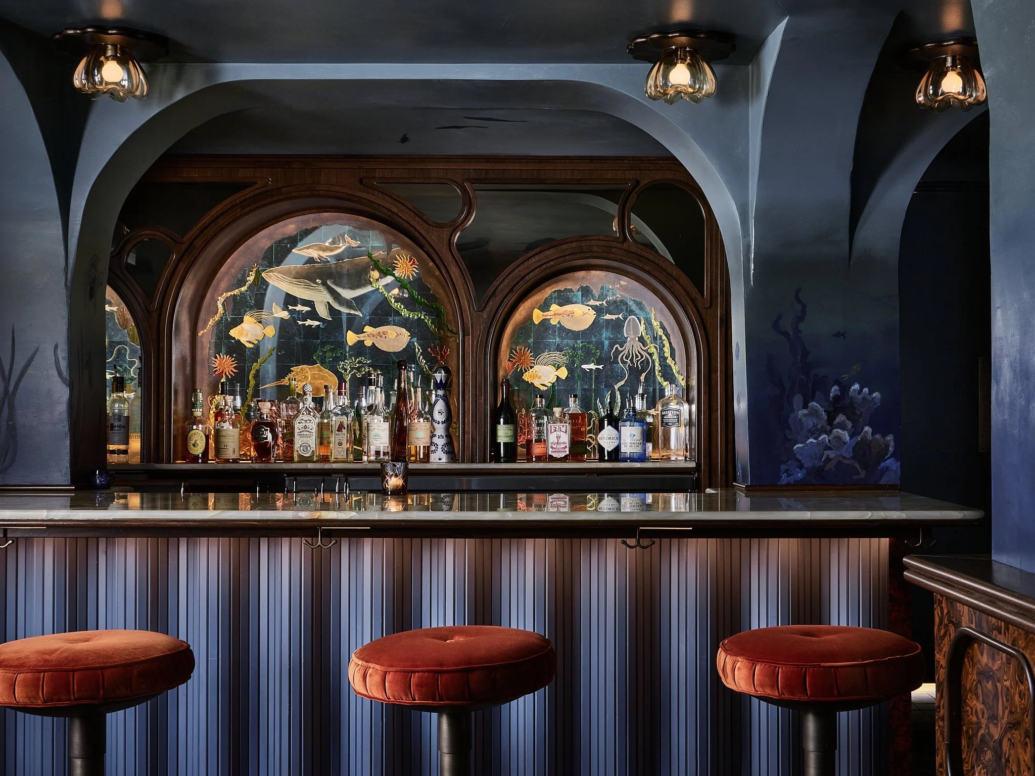
Tucked discreetly beneath The Pearl, this is not a spot you’ll stumble upon by accident. Like the sea, the allure lies within it’s mystery. With limited space and a reputation for being hard to get into, Below The Rose is the epitome of, “if you know, you know.”
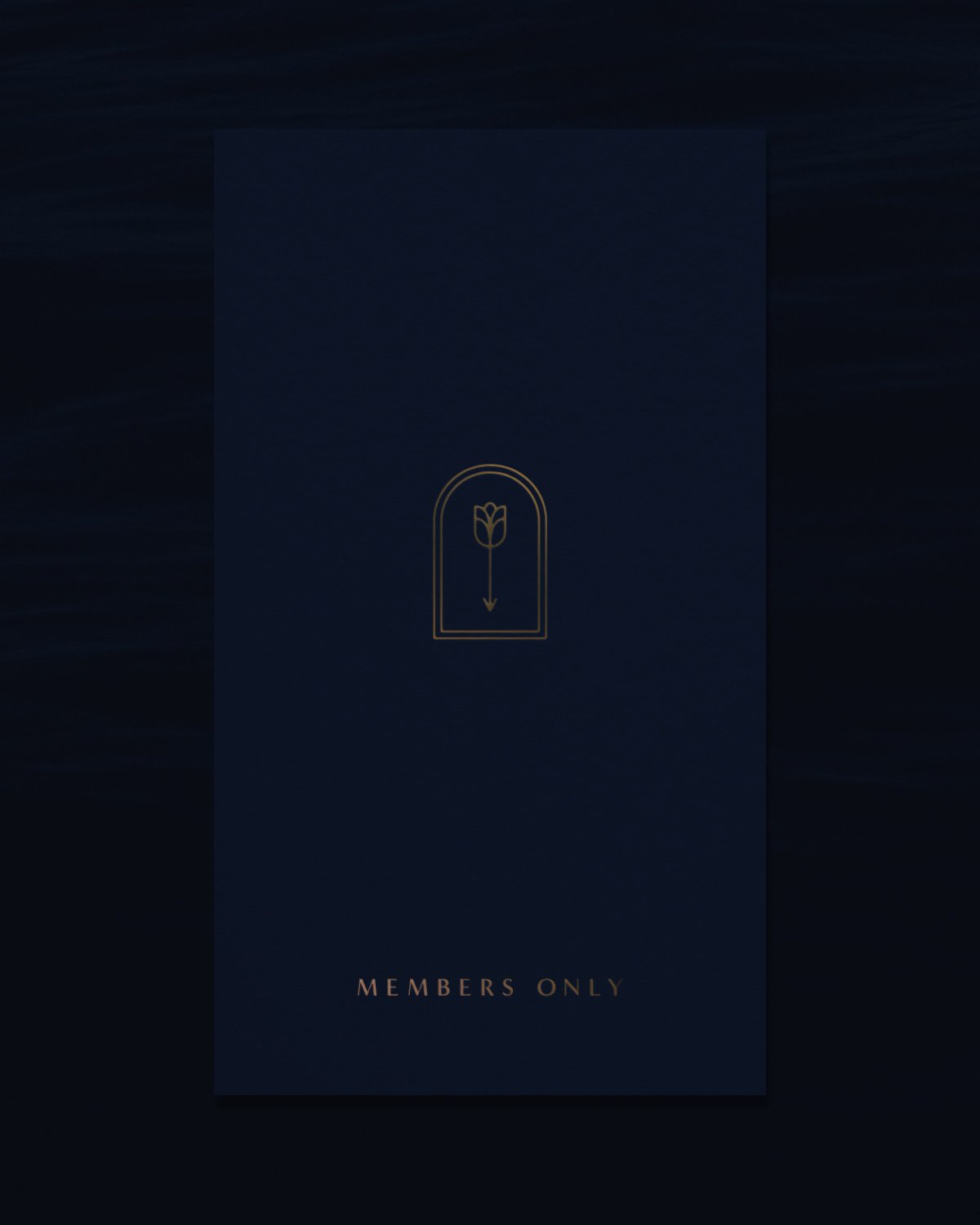
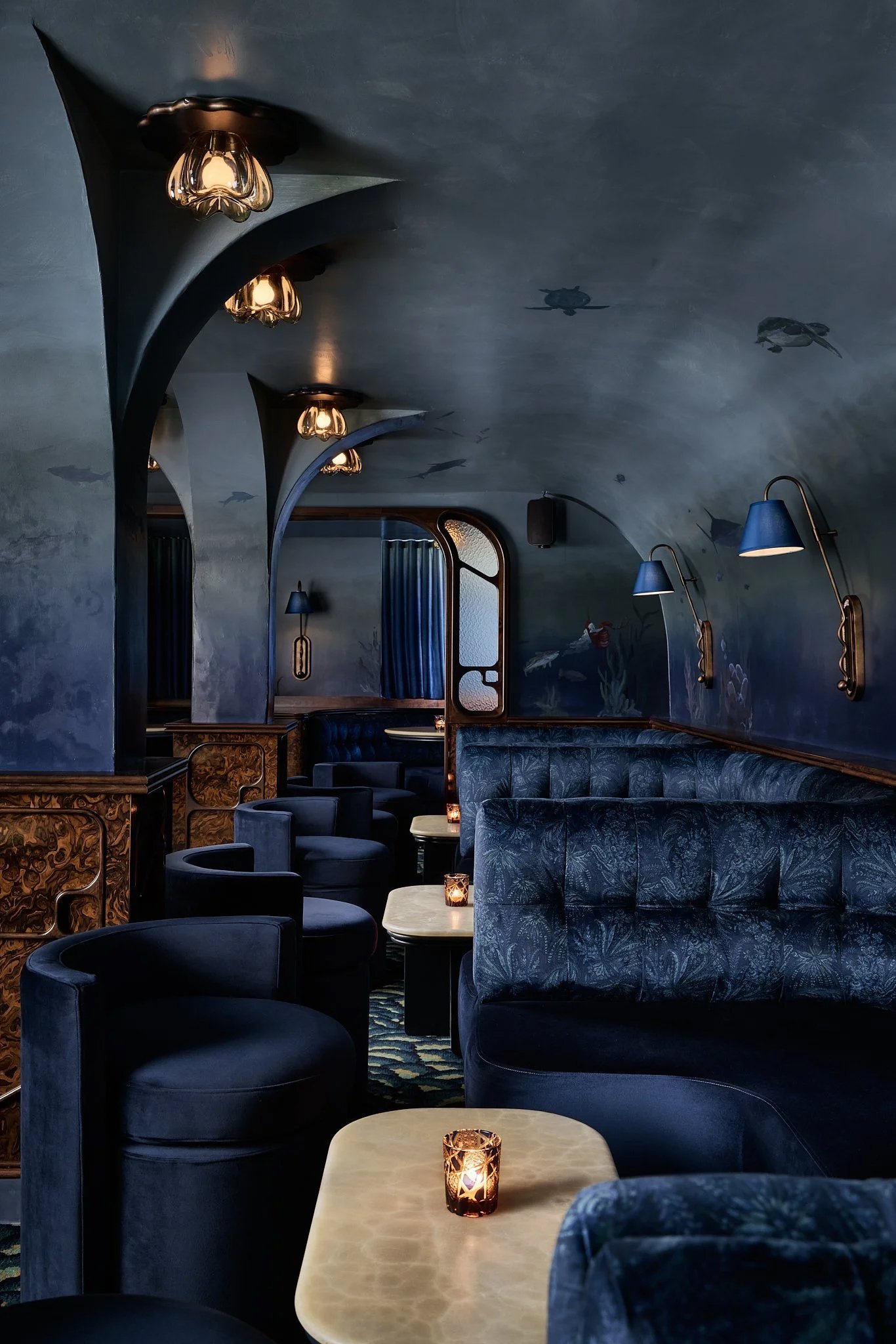
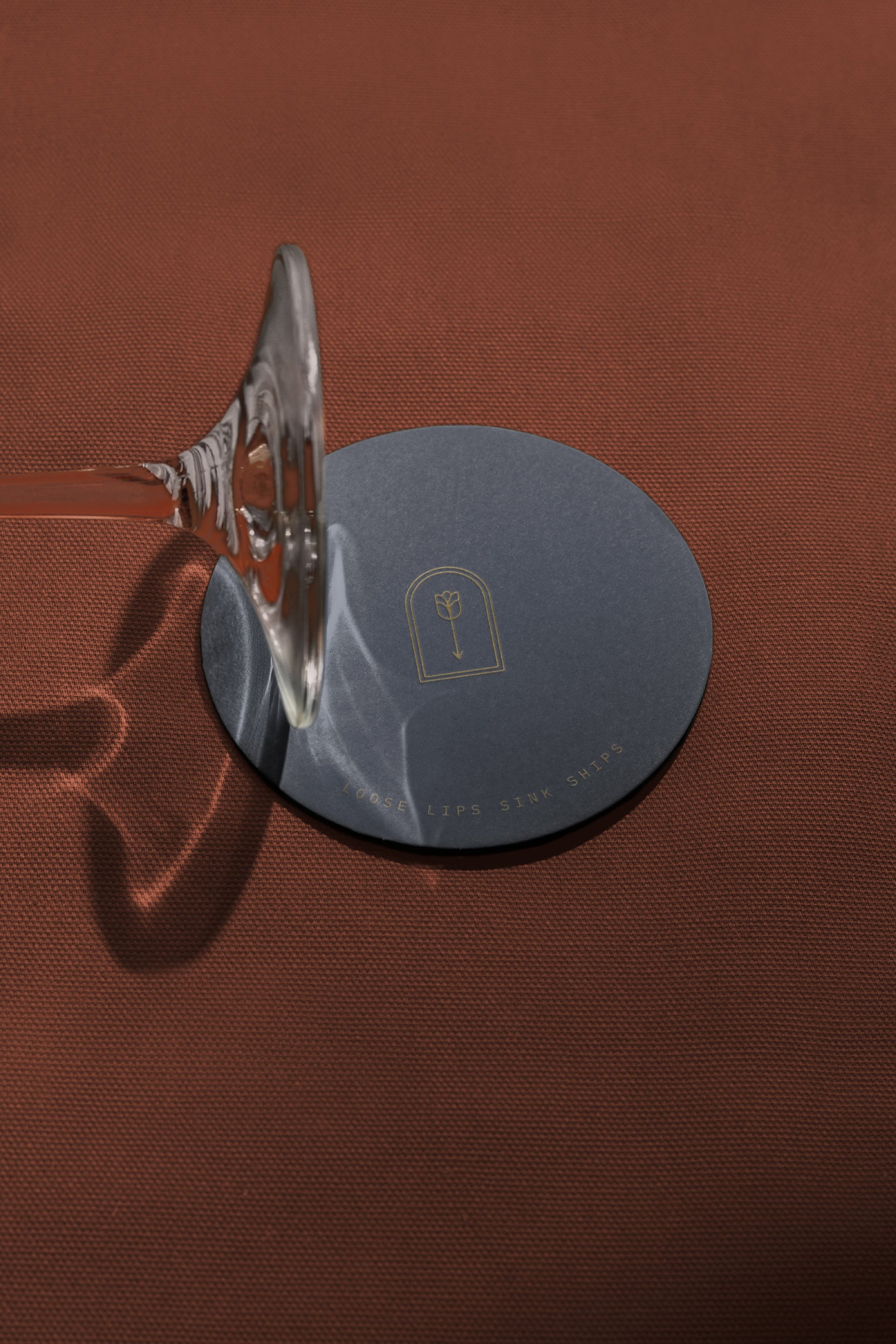
“Mystery remains” – which is why we created a straightforward and restrained brand for Below the Rose, which consists of only a symbol.
WHAT WE DID
Naming, Logo, Brand Guidelines, Web Direction, Illustration, Collateral, Signage, Stationery, Packaging
CREDITS
Brand Design: Vin Conti, Brendan Prince
Illustration: Brittain Peck
Photography: Holly Estrow, Matt Kisiday, Reagan Byrne
Interiors: Home Studios
Strategy: Sonnyrose
CLIENT
Blue Flag Capital
The Pearl
CATEGORIES